Project Overview
View project


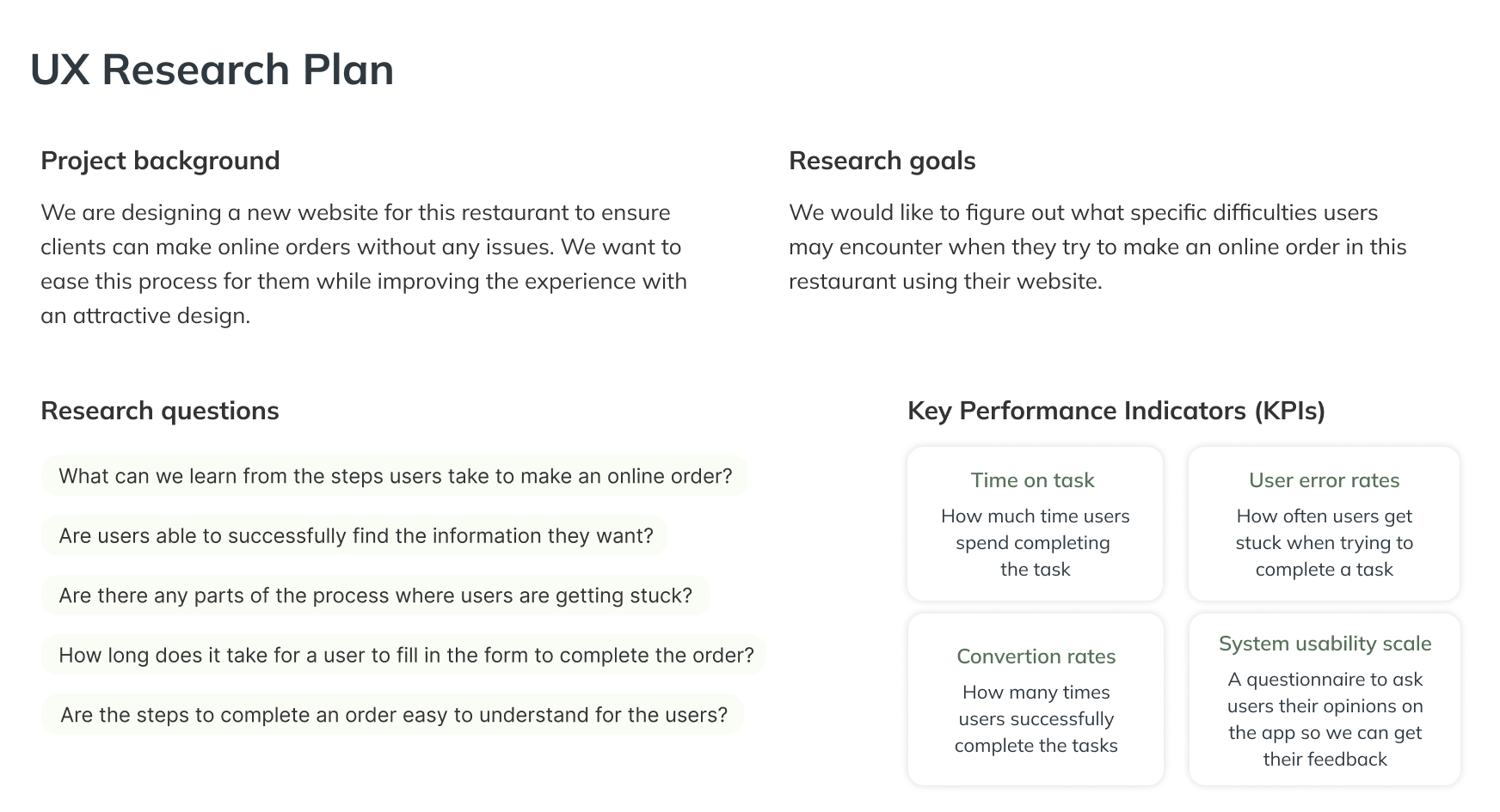
We are designing a new website for Dong Sushi restaurant to ensure clients can make online orders without any issues. We want to ease this process for them while improving the experience with an attractive design.Dong Sushi is a restaurant that offers exceptional quality with their freshly made Japanese dishes. My goal is to deliver a website that allows quick and easy ordering of food online while making it an enjoyable experience for the user. This future website works perfectly on different devices with the purpose that users can place their orders anywhere and anytime.
With the advance of new technologies, it is difficult for some users to keep up with these developments. They cannot enjoy the benefits of websites, and mobile and tablet apps, because they are not comfortable with them. Lately, it is popular to exercise at home, but it is also necessary to have some guidance through the process.


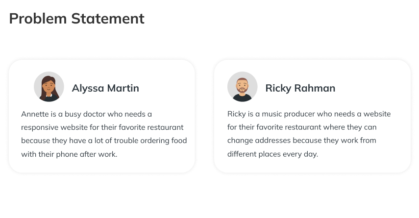
In order to understand the user I created different personas and journey maps. I also conducted interviews and created empathy maps to find user pain points and needs. A primary user group identified through research was people who enjoy food and ordering online since they don’t have much time to cook or go to a restaurant. These are the key insights:


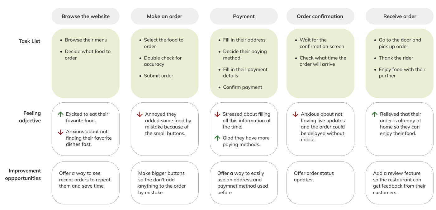
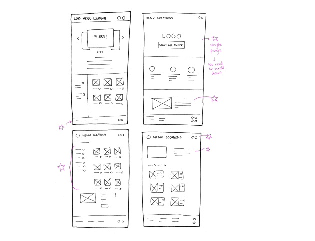
Next step was sketching out paper wireframes for each screen on the website, keeping the user pain points about navigation and responsive design in mind. Stars were used to mark the elements of each sketch that would be used in the initial digital wireframes. Because many users complained about experiencing trouble browsing the website on mobile, I started to work on designs for additional screen sizes to make sure the site would be fully responsive
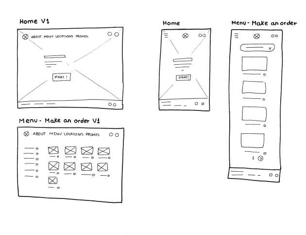

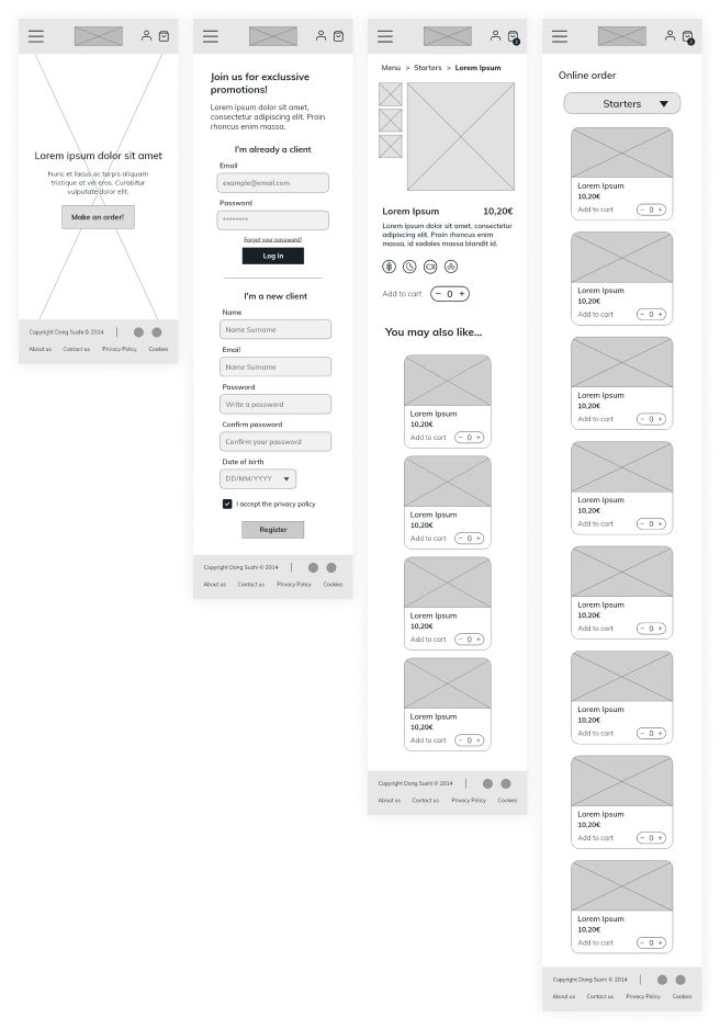
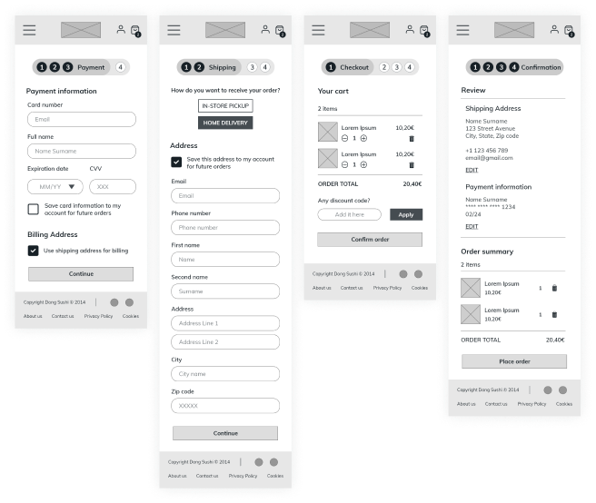
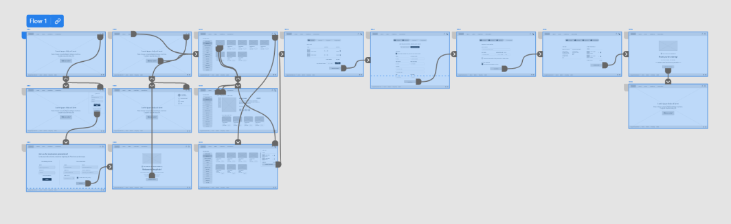
I connected all of the screens involved in the primary user flow to create my low-fidelity prototype. The primary user flow consisted of browsing the menu, adding an item to the cart and checking out. I received feedback on my designs about page organization and updated features, so I made sure to implement several suggestions to my design to address user pain points.
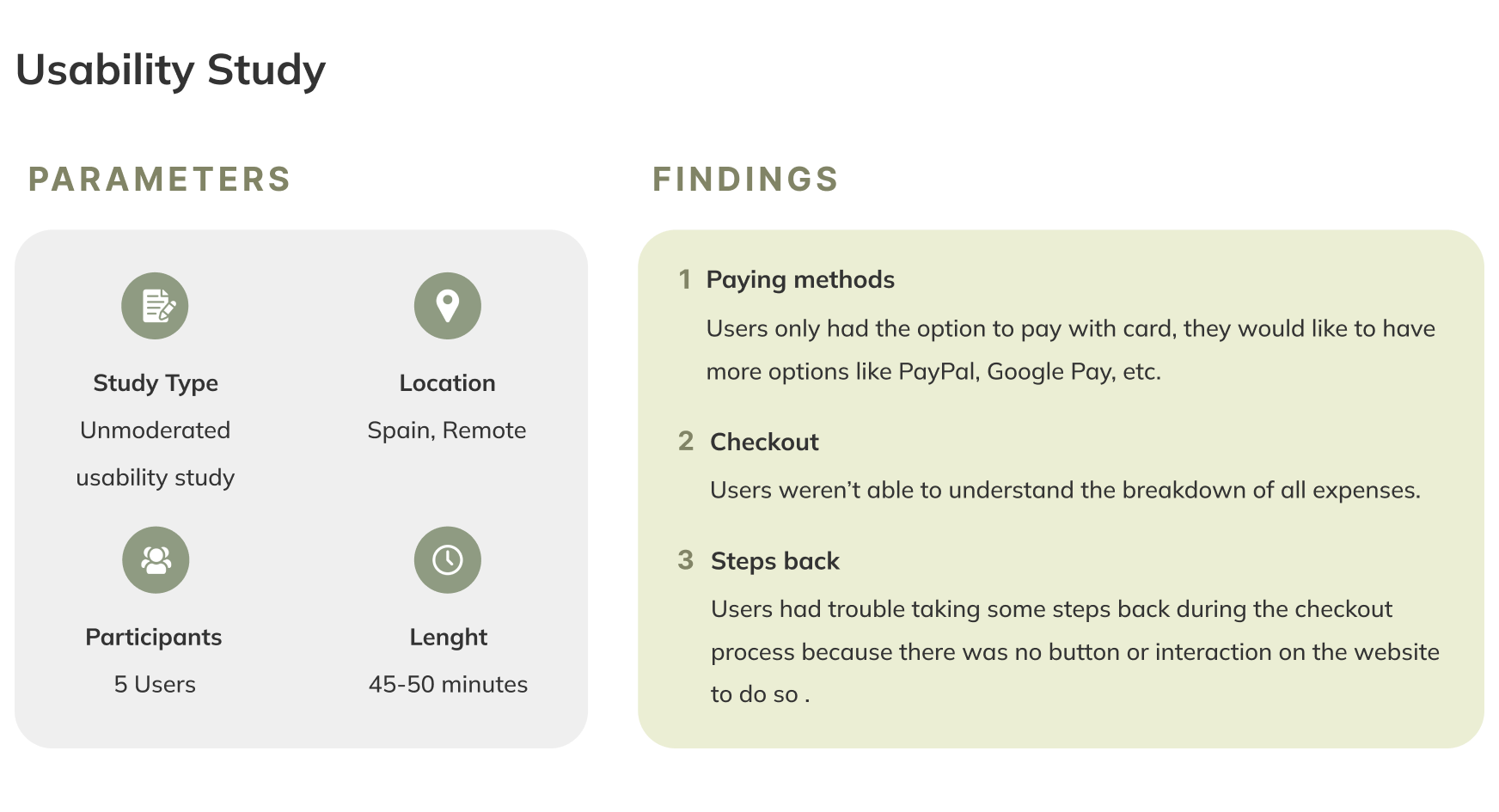
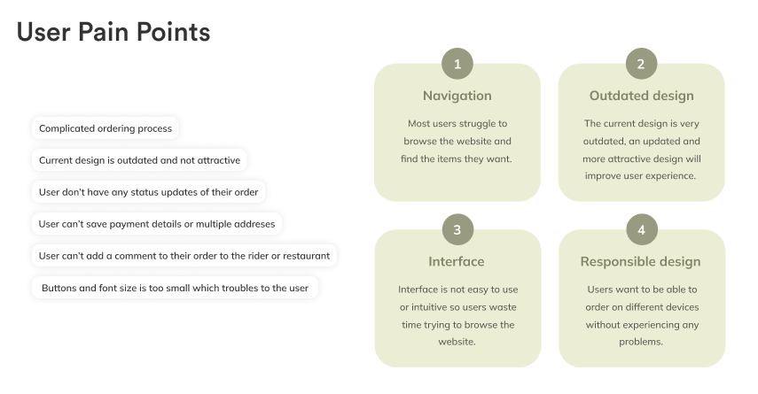
1. Based on the theme that: some users didn't understand the breakdown of all expenses, an insight is: users need better cues of in the order confirmation page.
2. Based on the theme that: some users had trouble taking steps back during the checkout process, an insight is: users need a button or interaction on the website to do so.
1. Based on the theme that: some users weren't comfortable with having only one payment method, an insight is: users need more options like PayPal, Google Pay, etc.
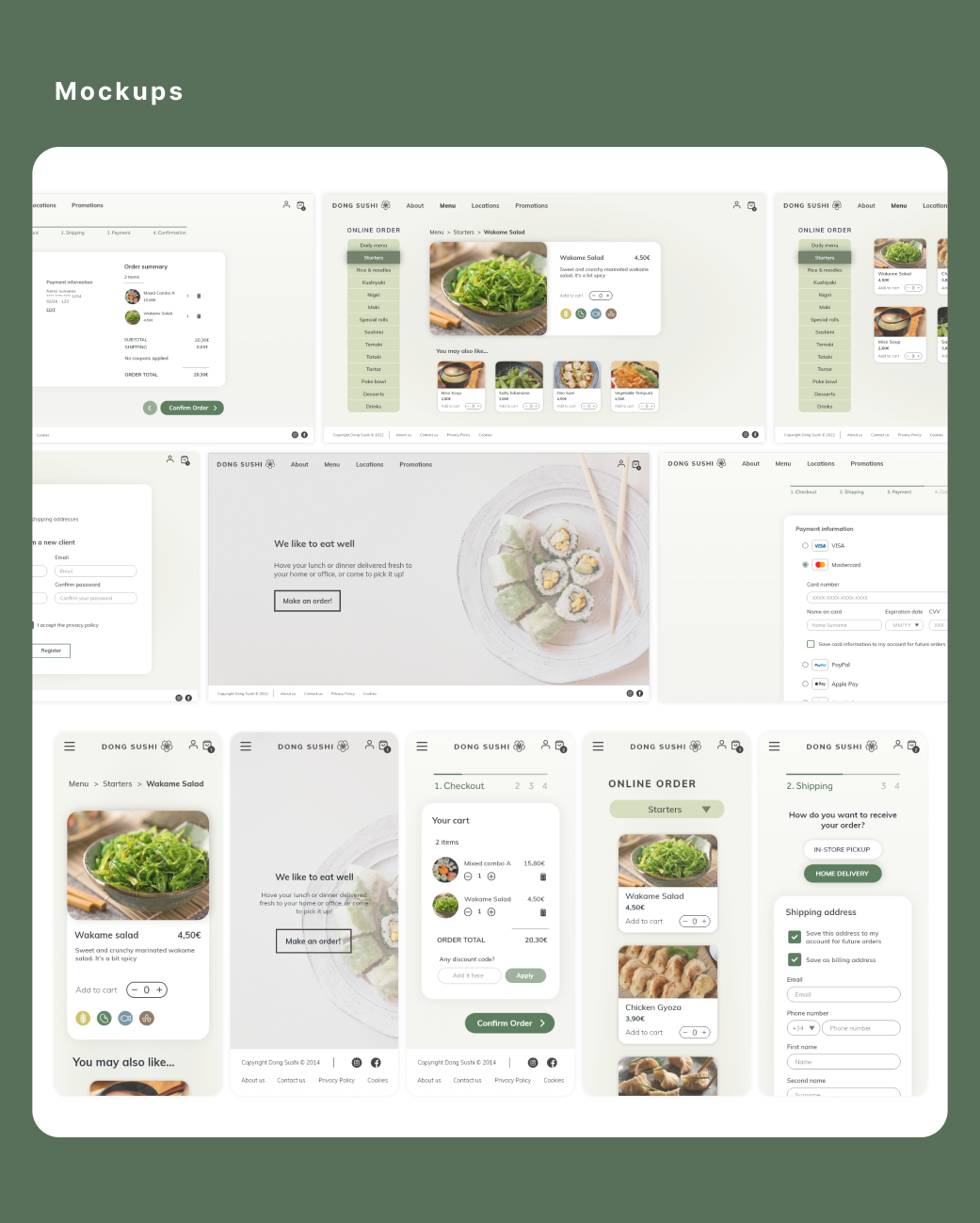
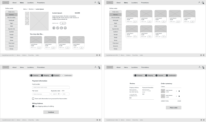
My high-fidelity followed the same user flow as the low-fidelity prototype. There are some design changes suggested by users thanks to the usability study.

Our target users shared that they were satisfied with the updated design and found it intuitive to navigate through, more engaging, and easier to browse.I have learned that all of my design choices have a huge impact on the user experience. As a designer, I need to always focus on users' actual needs when I think of design solutions.
Conduct another round of usability studies to validate all the pain points users experienced are solved. We can also determine if there are any new pain points to be addressed. I would also ask for peer feedback to improve the design if needed.


