Project Overview


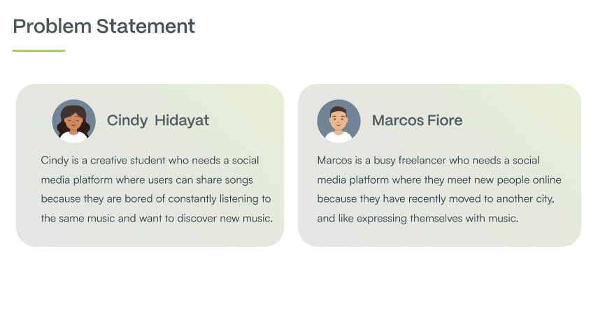
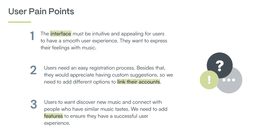
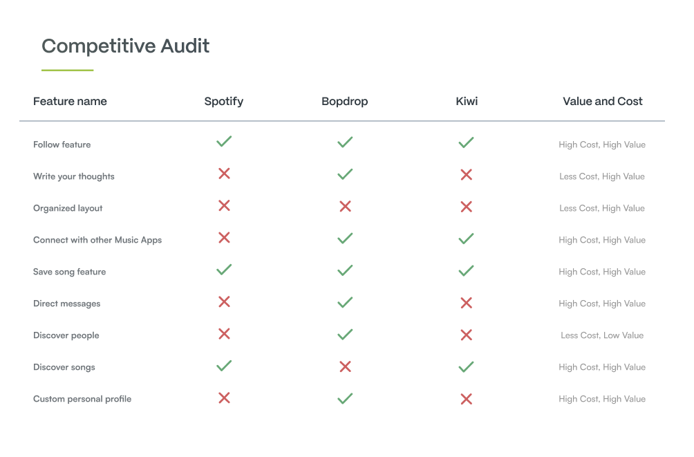
Groovy is a social media platform for everyone to find and share music. These days many people like expressing themselves on social media. There are different platforms where you can upload images and videos, but many users feel the need to share their favorite songs with the world and express their feelings too. My goal is to create an app that feels familiar to users and has a very intuitive and easy-to-use interface. Groovy has all features users need to share their favorite songs and discover new ones.
With the advance of new technologies, it is difficult for some users to keep up with these developments. They cannot enjoy the benefits of websites, and mobile and tablet apps, because they are not comfortable with them. Lately, it is popular to exercise at home, but it is also necessary to have some guidance through the process.


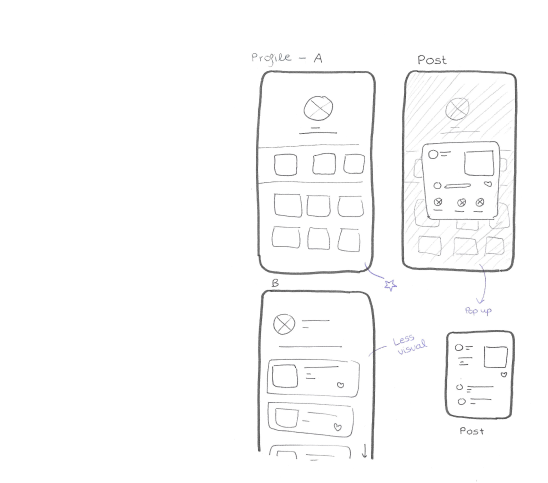
The first step in the design phase was sketching paper wireframes for each screen, trying the different ideas I had in mind. Here are some examples.I added notes in blue so it would be easier for me when I turn them into digital wireframes.

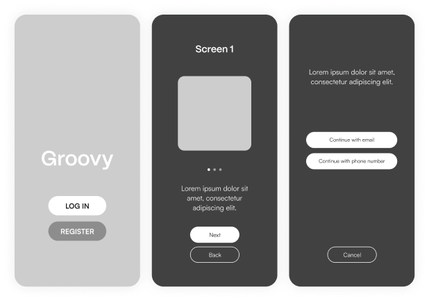

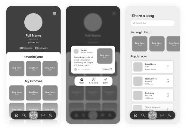
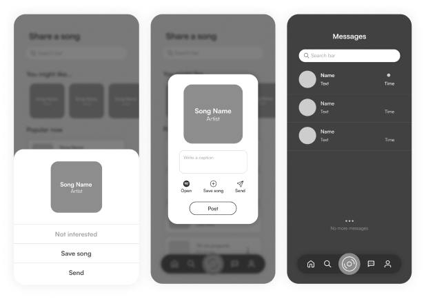
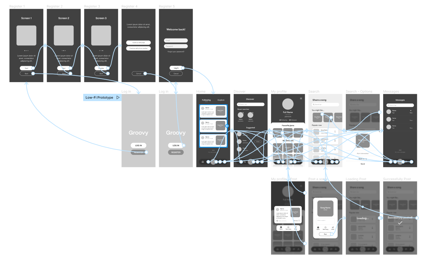
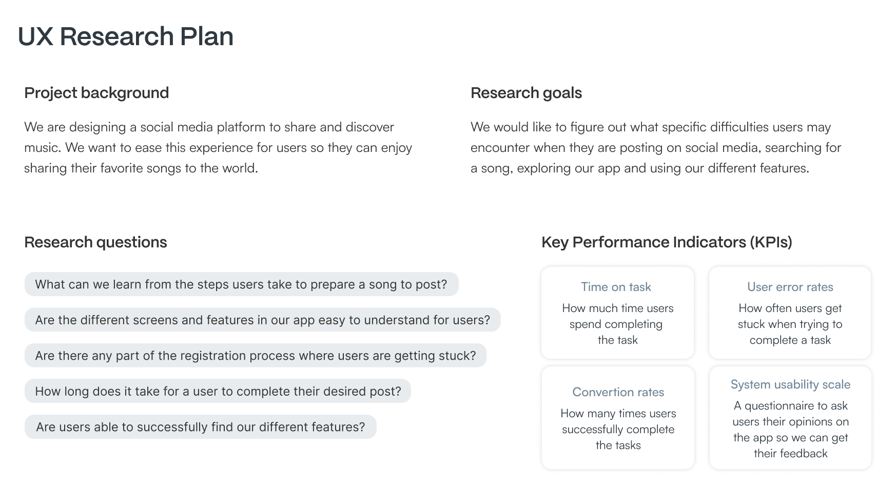
I connected all of the screens involved in the primary user flow to create my low-fidelity prototype. Users tested this prototype in a usability study. I created my UX Research Plan and conducted an unmoderated usability study to help me improve my designs. The primary user flow consisted of:
- Check how to create an account
- Log in using their email
- Browse our app
- Check a recent post
- Check options in a song suggestion
- Create a post
- Publish
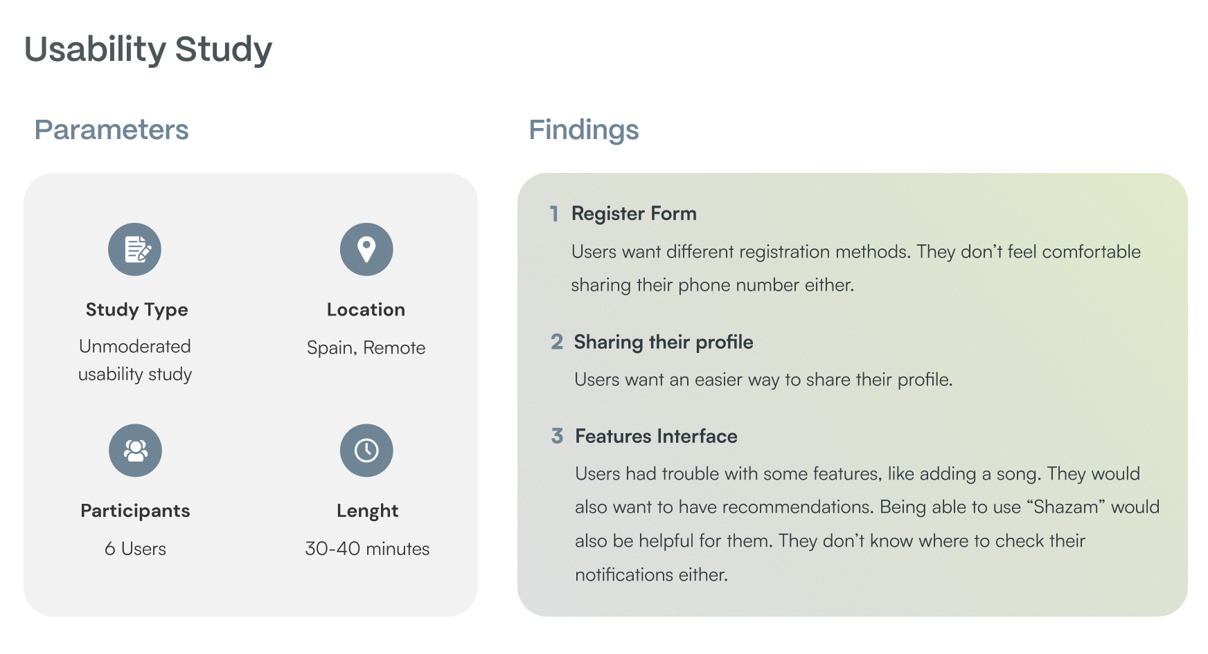
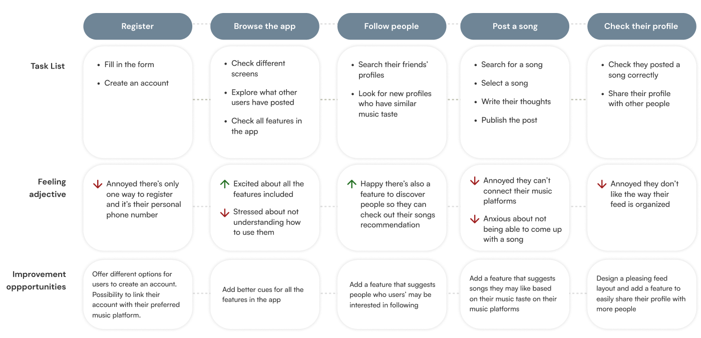
1. Based on the theme that: some users asked for a feature that allows them to save an unfinished post, an insight is: users need a feature to save their drafts to post songs later.
2. Based on the theme that: almost all users were confused about where to find their notifications and saved songs an insight is: users need better cues for checking their saved songs in their profile and where to check their notifications.
1. Based on the theme that: some users don’t feel comfortable sharing their phone numbers, an insight is: users need more registration options instead of having only their email and phone number.
2. Based on the theme that: some users have trouble sharing their profile information, an insight is: users need a new feature that allows them to easily share their profile on our app.
1. Based on the theme that: some users want our app to identify a song they are listening to, an insight is: users need a feature that allows access to “Shazam”.

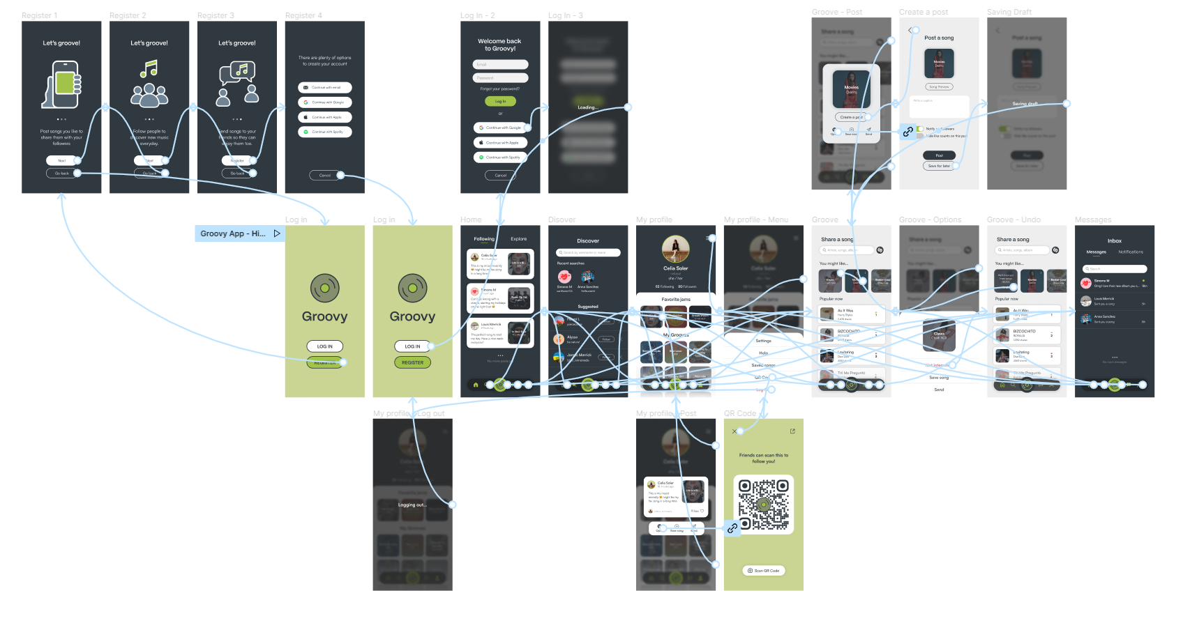
I connected all of the screens involved in the primary user flow to create my high-fidelity prototype. The primary user flow consisted of:
- Check how to create an account
- Log in using their Google linked account
- Browse our app
- Check a recent post
- Open the song from the post on Spotify
- Check the QR Code in their profile
- Discard a song suggestion and undo it
- Create a post
- Save it for later
- Log out
I had this project in mind for a long time, so I'm pleased to see it come to life. User feedback was key to improving my initial design and solving user pain points. I feel fulfilled that I created an app that I would personally love to use. I worked on this project on a tight schedule to deliver it as soon as possible, but I had to face this challenge to improve as a designer since there are many times when we have to work with short deadlines.
Collect more feedback and explore use cases that will help me to improve my design. Validate all the pain points users experienced have been solved and determine if there are any new pain points to be addressed.