Project Overview
View project


Helping Paws is a regional animal shelter. Helping Paws strives to help stray animals to find an ideal home for them. The adoption process can be a little complicated, so they want to make sure users are well informed all along the process while making sure future animal owners are suitable for these pets.
I want to design an app that makes this process easier for the users, and keeps them updated while ensuring they are the appropriate profile for these pets.
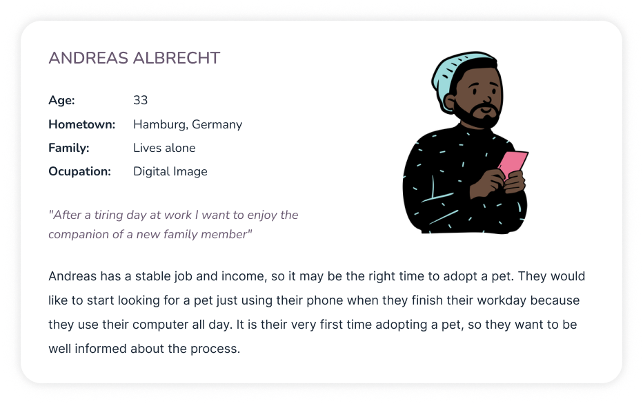
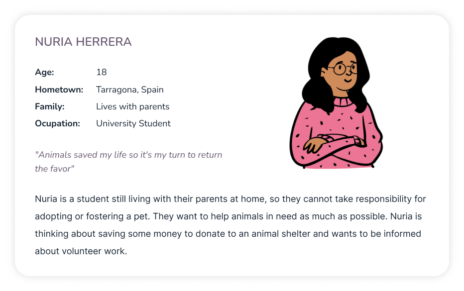
With the advance of new technologies, it is difficult for some users to keep up with these developments. They cannot enjoy the benefits of websites, and mobile and tablet apps, because they are not comfortable with them. Lately, it is popular to exercise at home, but it is also necessary to have some guidance through the process.


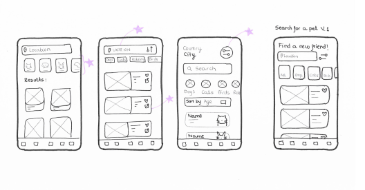
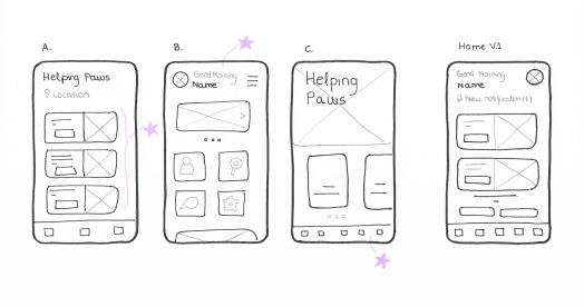
Here are some examples of the initial ideas for some of the screens. I prioritized a quick and easy way to search for a pet and find helpful tips for the users. Stars were used to mark the elements of each sketch that would be used in the initial digital wireframes.
As the initial design phase continued, I made sure to base screen designs on feedback and findings from the user research. A screen where the user can check all updates was a key user need to address in the designs.


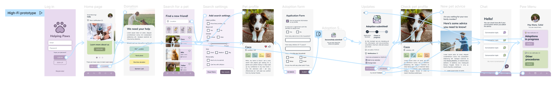
Using the completed set of digital wireframes, I created a low-fidelity prototype. The primary user flow I connected was searching for a pet and checking the updates on the adoption status. This prototype was later tested in a usability study.


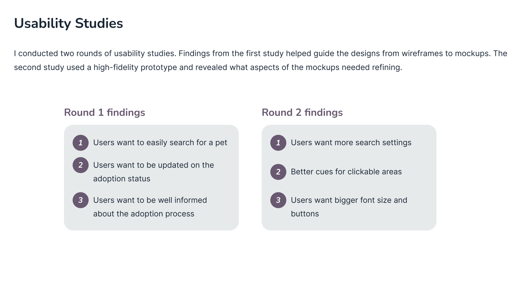
1. Based on the theme that: for most users it’s not immediately clear if they need to log in or register to browse the app, an insight is: users need better cues for the ability to browse the app without creating an account or logging in.
2. Based on the theme that: almost all users asked for more search settings in the app, an insight is: users need more searching features in the app to ease the user experience.
1. Based on the theme that: some users were unsure where they could press to read articles or open a new chat, an insight is: users need better cues for where they need to press to find what they need.
2. Based on the theme that: not everyone finds the adoption form easy to fill in, an insight is: use accessible language and add better explanations in the adoption form.
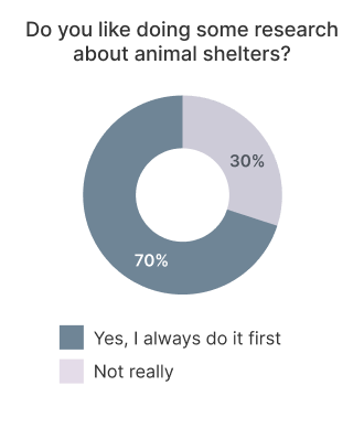
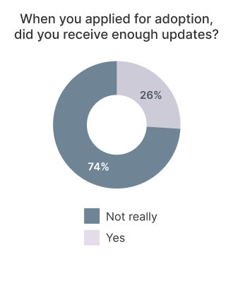
1. Based on the theme that: adoption status updates are useful and clear for most people, but not an overwhelming majority, an insight is: users need better explanations in the adoption status updates.

Early designs allowed for some customization, but after the usability studies, I changed the display of the different articles to facilitate the reading. I also revised the overall design to make it easier for the users to see all the actions they can take when they first land on the screen. The second usability study revealed that users wanted to have more search settings in the app to ease the user experience. I also added a confirmation screen when the user completed the adoption form.
The final high-fidelity prototype presented cleaner user flows for searching for a pet. It also met user needs for a screen for adoption status updates.
While designing the Helping Paws app, I learned that there are plenty of things to keep in mind while making design choices for an app. User needs can be very different depending on the target audience. Usability studies are very useful for getting feedback and making our designs better
Conduct another round of usability studies to validate all the pain points users experienced are solved. We can also determine if there are any new pain points to be addressed. I would also ask for peer feedback to improve the design if needed.


