Project Overview
View project


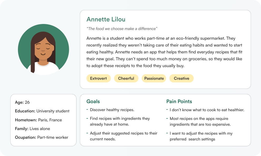
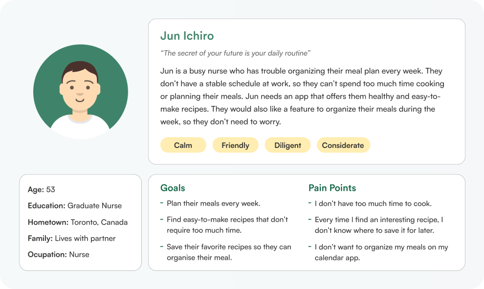
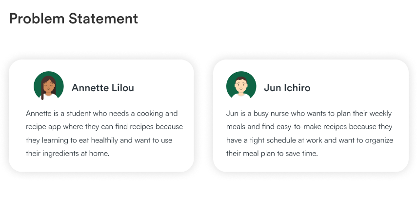
Yummy bites is a cooking and recipe app that wants to make homemade cooking more appealing and easier for everyone. Many users find it hard to plan their meals during the week and need a little help thinking about different recipes. We want to help them enjoy cooking and eating healthy.My goal is to ease this experience for them. I want to know what specific difficulties users may encounter while using cooking and recipe apps and solve them so they can enjoy their meal time even more.
With the advance of new technologies, it is difficult for some users to keep up with these developments. They cannot enjoy the benefits of websites, and mobile and tablet apps, because they are not comfortable with them. Lately, it is popular to exercise at home, but it is also necessary to have some guidance through the process.
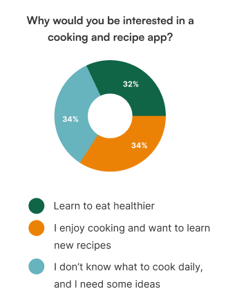
To understand our users’ pain points, I conducted a survey. My goal was to see what features users needed the most and were missing in their usual cooking apps. I asked users what tools or features they would like in a cooking and recipe app. There were multiple common answers, so I turned these into insights:
I also wanted to know how important these features are for users using the recipe instructions. The most common answer was 5 out of 5 when rating the importance of these ( 1 = Not important ; 5 = Very important ).
- Images showing the cooking process
- Videos showing the cooking process
- Screen reader for the instructions

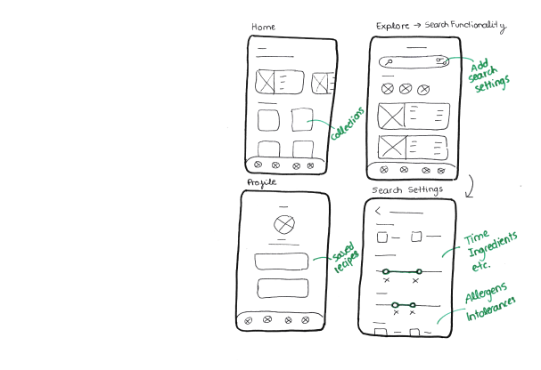
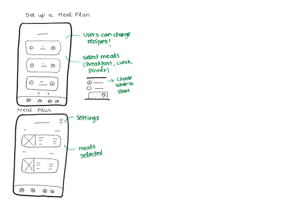
The first step in the design phase was sketching paper wireframes for each screen, trying the different ideas I had in mind. Here are some examples.I added notes in green so it would be easier for me when I turn them into digital wireframes.

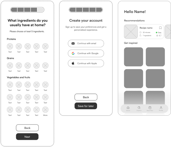
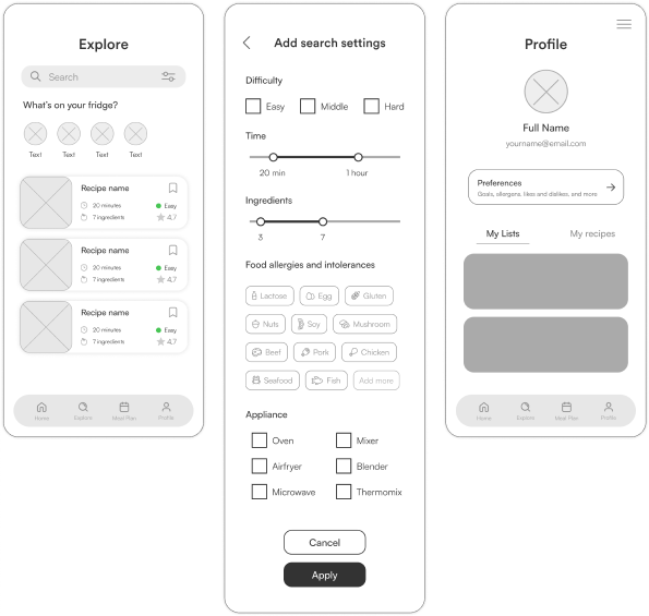
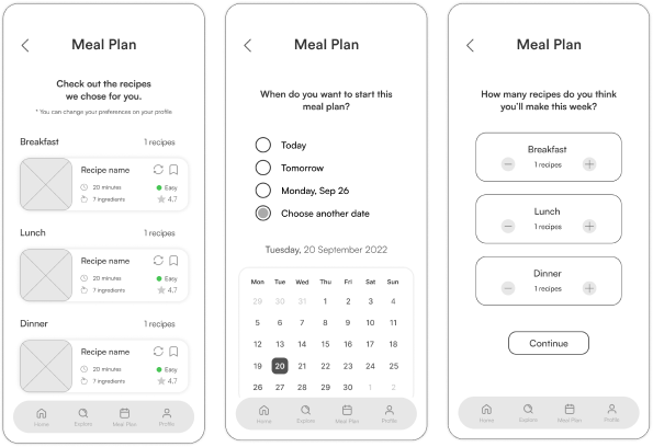
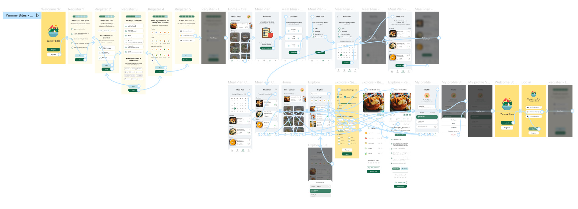
I connected all of the screens involved in the primary user flow to create my low-fidelity prototype. Users tested this prototype in a usability study. I created my UX Research Plan and conducted an unmoderated usability study to help me improve my designs. The primary user flow consisted of:
- Create an account
- Fill in the form with food preferences
- Set a meal plan
- Browse explore screen
- Check search settings
- Browse home screen
- Browse profile screen


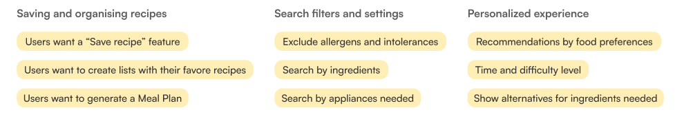
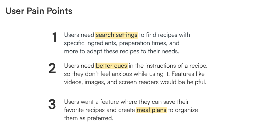
1. Based on the theme that: some users asked for a recipe screen that allows them to check the instructions, an insight is: users need a recipe screen to check the cooking process.
2. Based on the theme that: almost all users were confused about how to create a recipe list, an insight is: users need better cues for creating custom recipe lists when clicking the button.
1. Based on the theme that: some users don’t feel comfortable not being able to change the ingredients, an insight is: users need a feature so they can change the ingredients for a suitable option.
2. Based on the theme that: some users have trouble using their phones while cooking, an insight is: users need a feature that shows them images or a video of the process; or a screen reader that reads out the instructions for them.
1. Based on the theme that: some users want to see more images of the recipes, an insight is: users need images on our recipe boxes; so it is more appealing.

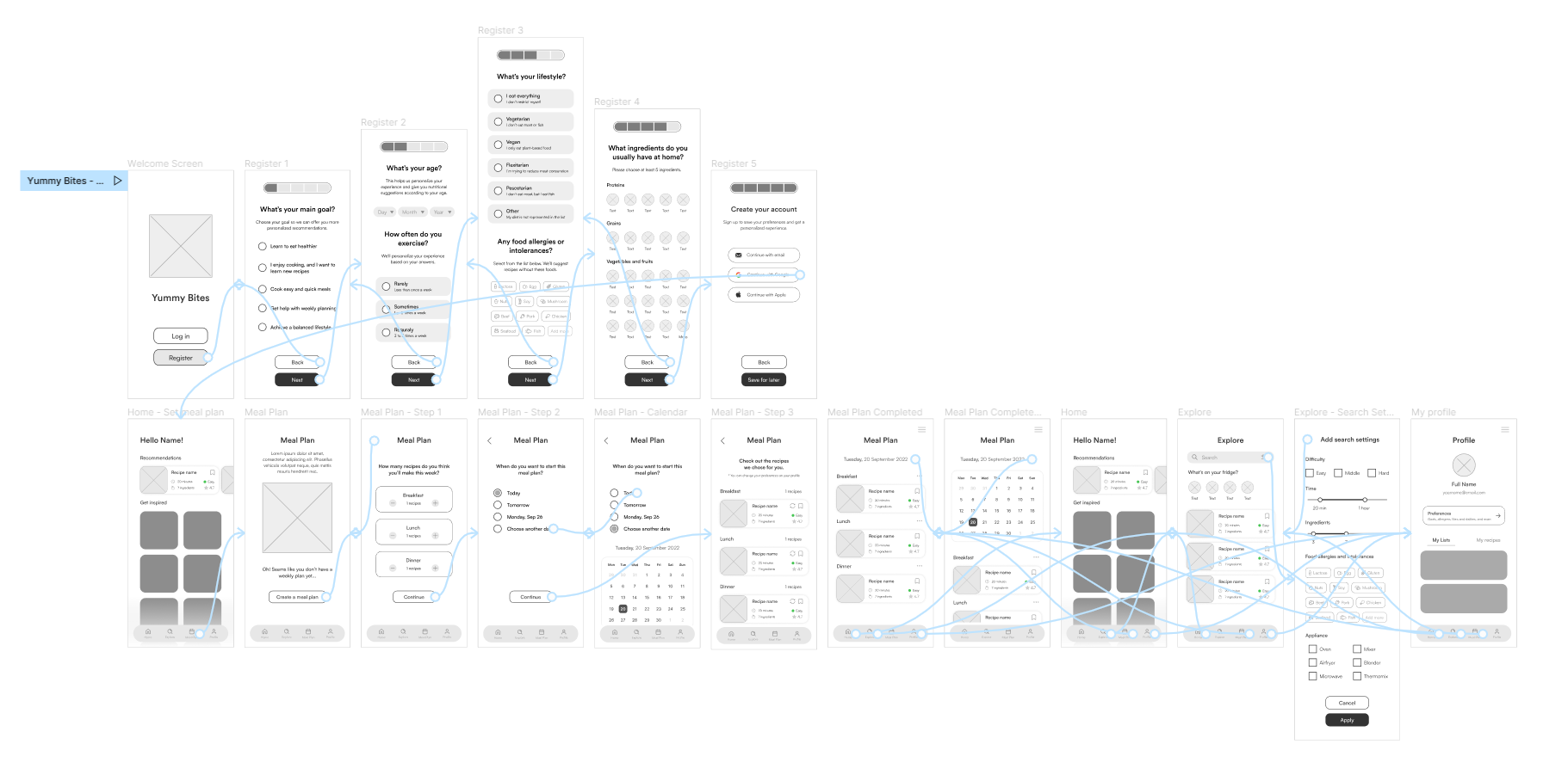
I connected all of the screens involved in the primary user flow to create my high-fidelity prototype. The primary user flow consisted of:
- Create an account
- Fill in the form with food preferences
- Set a meal planBrowse explore screen
- Check search settings
- Check save recipe feature
- Browse home screen
- Browse profile screen
- Log Out
- Log In again using Google Account
It was a challenge for me to complete a project from scratch within a short time of 3 days, but it was also a stimulating experience that helped me grow as a designer. User feedback and research were decisive in improving my initial design and solving user pain points I missed in the beginning. I feel fulfilled that I have created an app accessible to everyone and includes features that will help users in their daily lives.
Collect more feedback and explore use cases that will help me to improve my design. Validate all the pain points users experienced have been solved and determine if there are any new pain points to be addressed. I will design and add more screen sizes so users can also use this app on their tablets.


